The call-to-action (CTA) is one of the most important elements to consider when designing a page, as it plays an essential role in shaping the user’s experience effectively.
In addition to color, shape, and other aspects related to design, where you place your CTAs will also help determine how effective your call-to-action buttons are.
When it comes to left versus right, research is pretty clear about what’s the best placement of your CTA. It’s RIGHT.
And it’s all because of the Gutenberg Diagram. The diagram marks a “Z” across a web page, separating the different optical areas within it. Each end and tip of the Z point to different levels of visual acuity and attentiveness of your visitors.
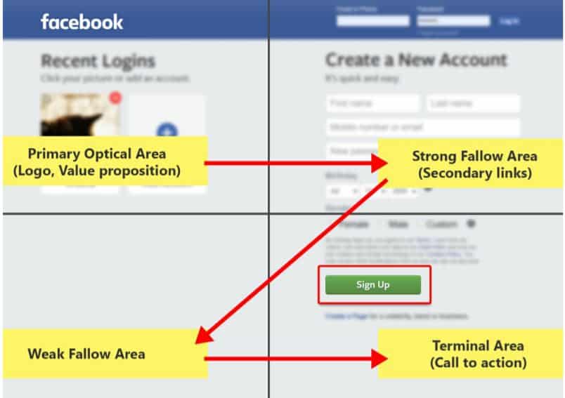
Based on this, the two spots on the right (at the first point of the “Z” and the very end of it) are the two areas of a page where visitors expect to take action.
That’s why your call-to-action should be towards the right side of the screen.
Source: wpmudev.org
Liked this hack? This is an example of what you’ve been missing out on.
This was a sample of the curated hacks we send to our growing Digital Marketing community every week.
Join Digital Marketing Superstars today! Become a part of our growing community and start receiving premium, easy to implement digital marketing ideas right in your inbox, every week. Plus, you’ll also get access to community-exclusive rewards that will help you grow your knowledge.